Context
This was a personal project to redesign a non profit organization. The non profit is SPEAK Mentorship which stands for "Support, Prepare, Empower, Aspiring, Kids" and their purpose is to build a professional network of women to empower and guide girls from immigrant families. They hope to provide support to girls to help navigate their future. I wanted their brand identity to match the confidence that they wanted to instill in young women. I did not believe that their current and existing identity did so.
This was a personal project to redesign a non profit organization. The non profit is SPEAK Mentorship which stands for "Support, Prepare, Empower, Aspiring, Kids" and their purpose is to build a professional network of women to empower and guide girls from immigrant families. They hope to provide support to girls to help navigate their future. I wanted their brand identity to match the confidence that they wanted to instill in young women. I did not believe that their current and existing identity did so.
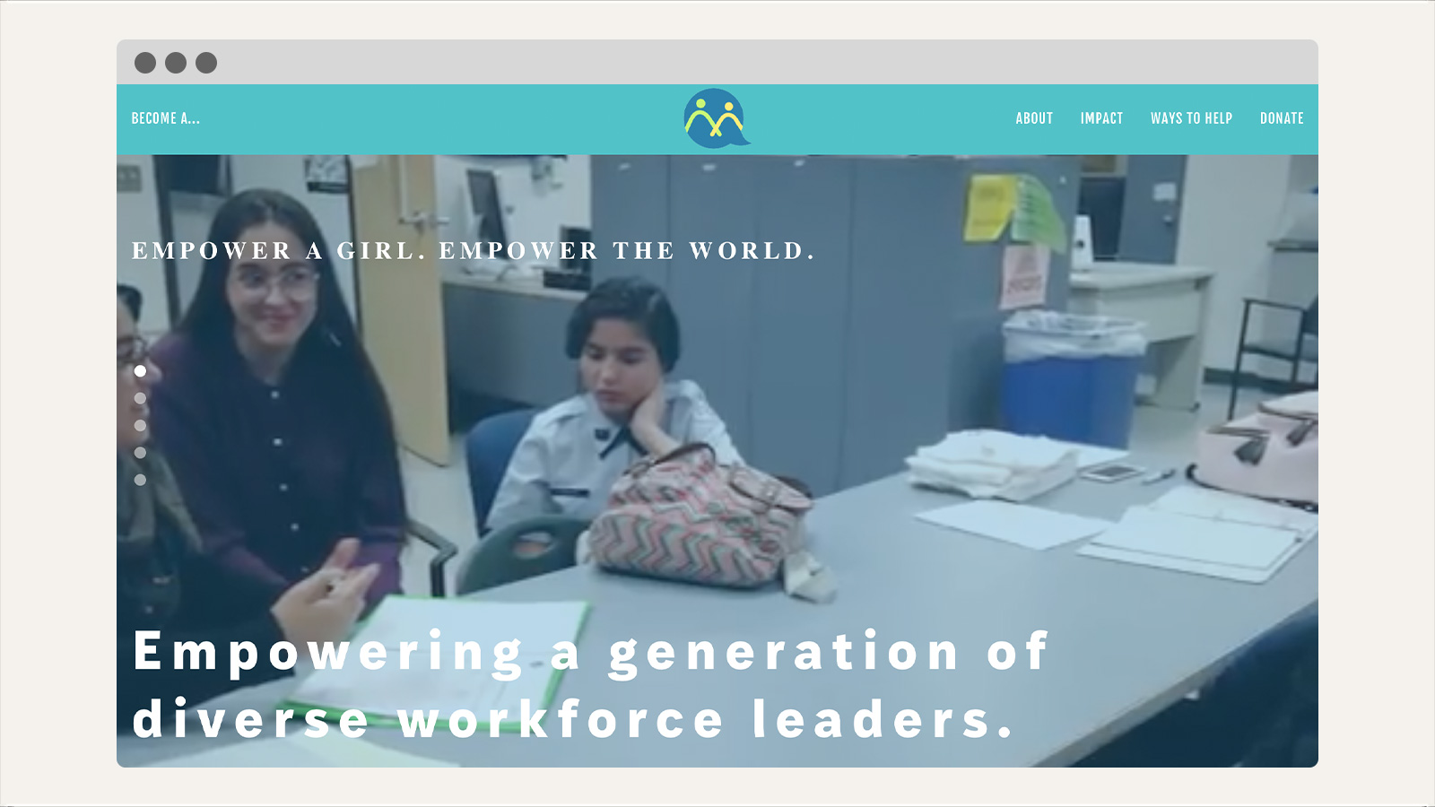
Current and Actual Design
![]()
Round 1
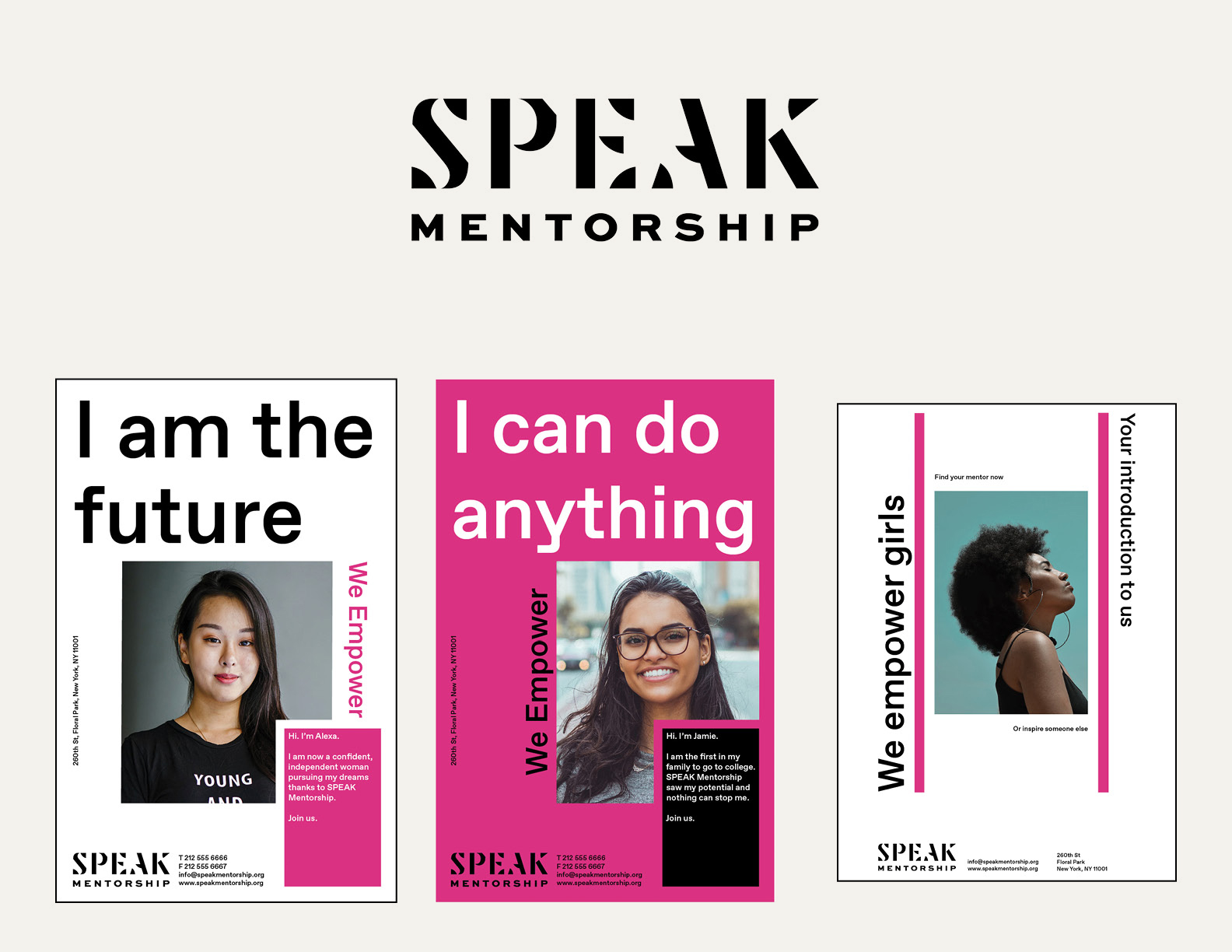
I began by working on the logo. Due to the fact that the name is an acronym, I knew I wanted each letter to have the same amount of importance in the logo. Therefore, I wanted all letters to be all capitalized or all lowercase. I began by experimenting with different typefaces and initially settled on this stencil font. I thought the boldness would match the confident nature of my idea. The other decision that I had made was the inclusion of the color pink. I wanted to reinvent the color and embrace pink's association with femininity.
The main issue that I had was the lack of readability with the chosen typeface. The "E" and "A" characters were not very legible. To test the logo, I had made some applications and ran into problems with them too. The shade of pink was too garish in large amounts and the layout wasn't compelling. What did work however were the bold lines I used.
Round 2
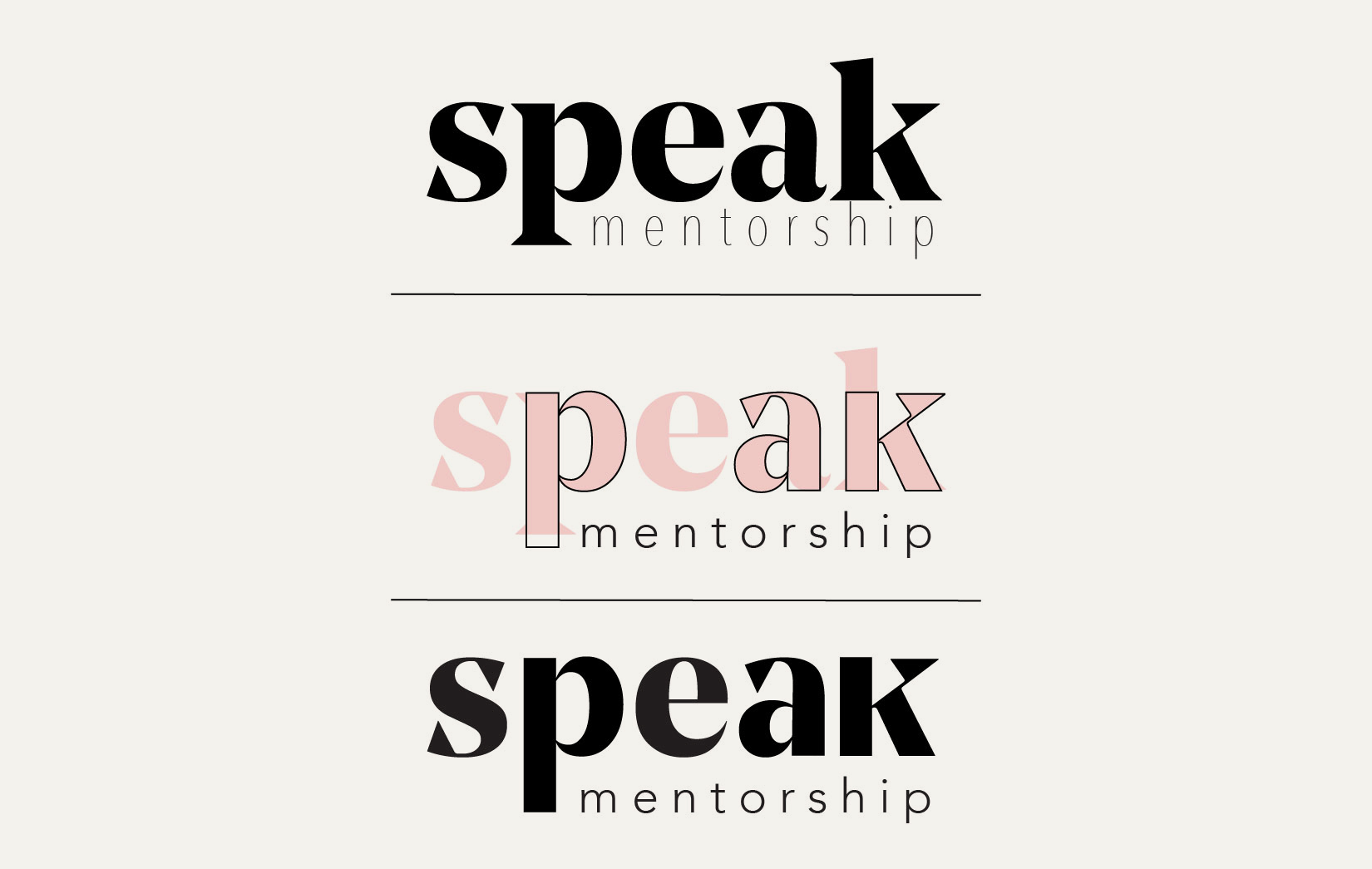
I decided to choose another typeface called Noe which I chose due to the modern wedge serifs. I took inspiration from the bold pink lines from one of my posters to redraw the typeface to get thick, rectangular stems on the characters. The final logo utilizes Noe Display Bold and Avenir. It makes an impact by displaying the name of the organization rather than relying on an abstract symbol like the actual logo. I felt this was very important since it does not have the name value of other, more prominent non profits.
I decided to choose another typeface called Noe which I chose due to the modern wedge serifs. I took inspiration from the bold pink lines from one of my posters to redraw the typeface to get thick, rectangular stems on the characters. The final logo utilizes Noe Display Bold and Avenir. It makes an impact by displaying the name of the organization rather than relying on an abstract symbol like the actual logo. I felt this was very important since it does not have the name value of other, more prominent non profits.
Visuals
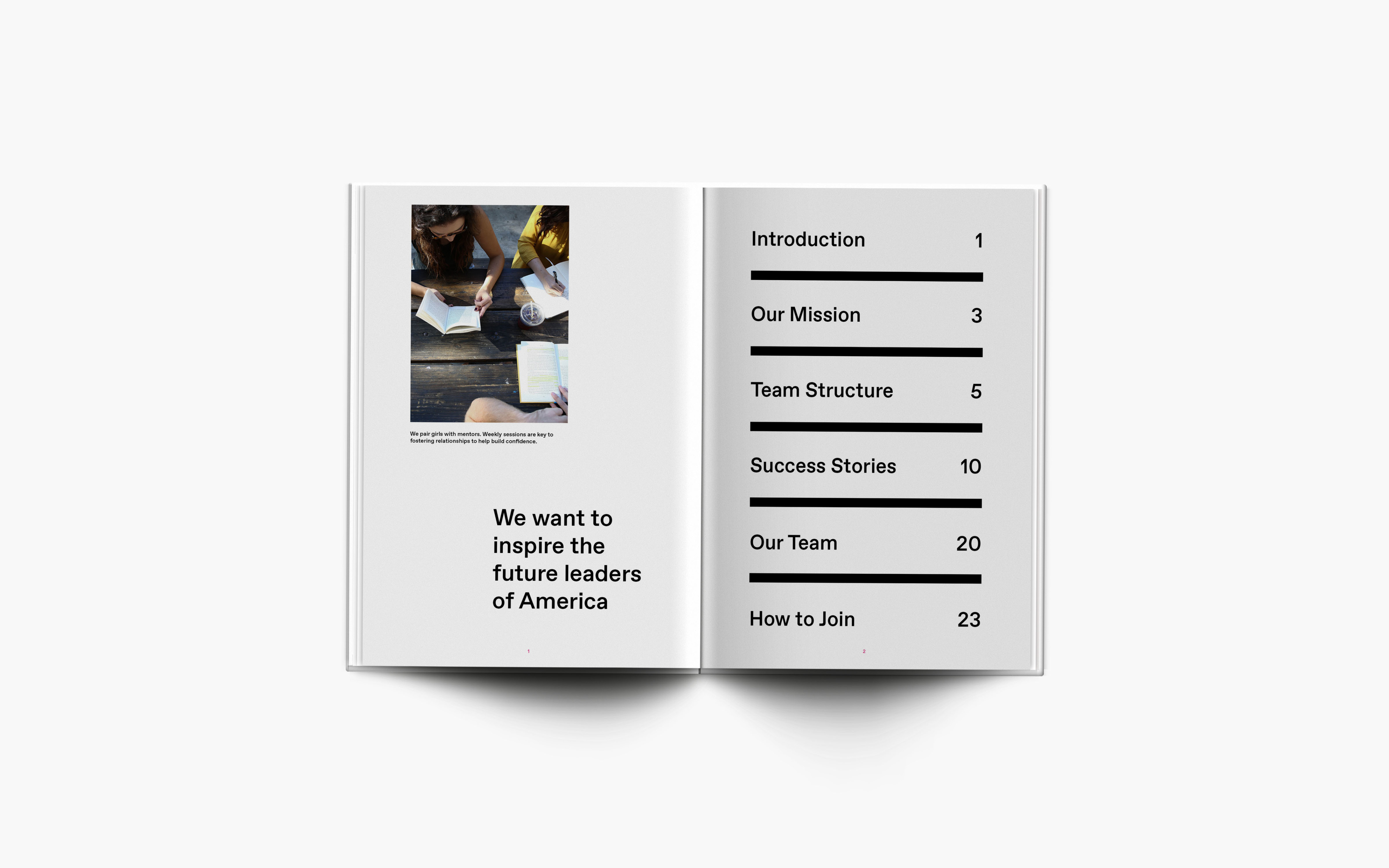
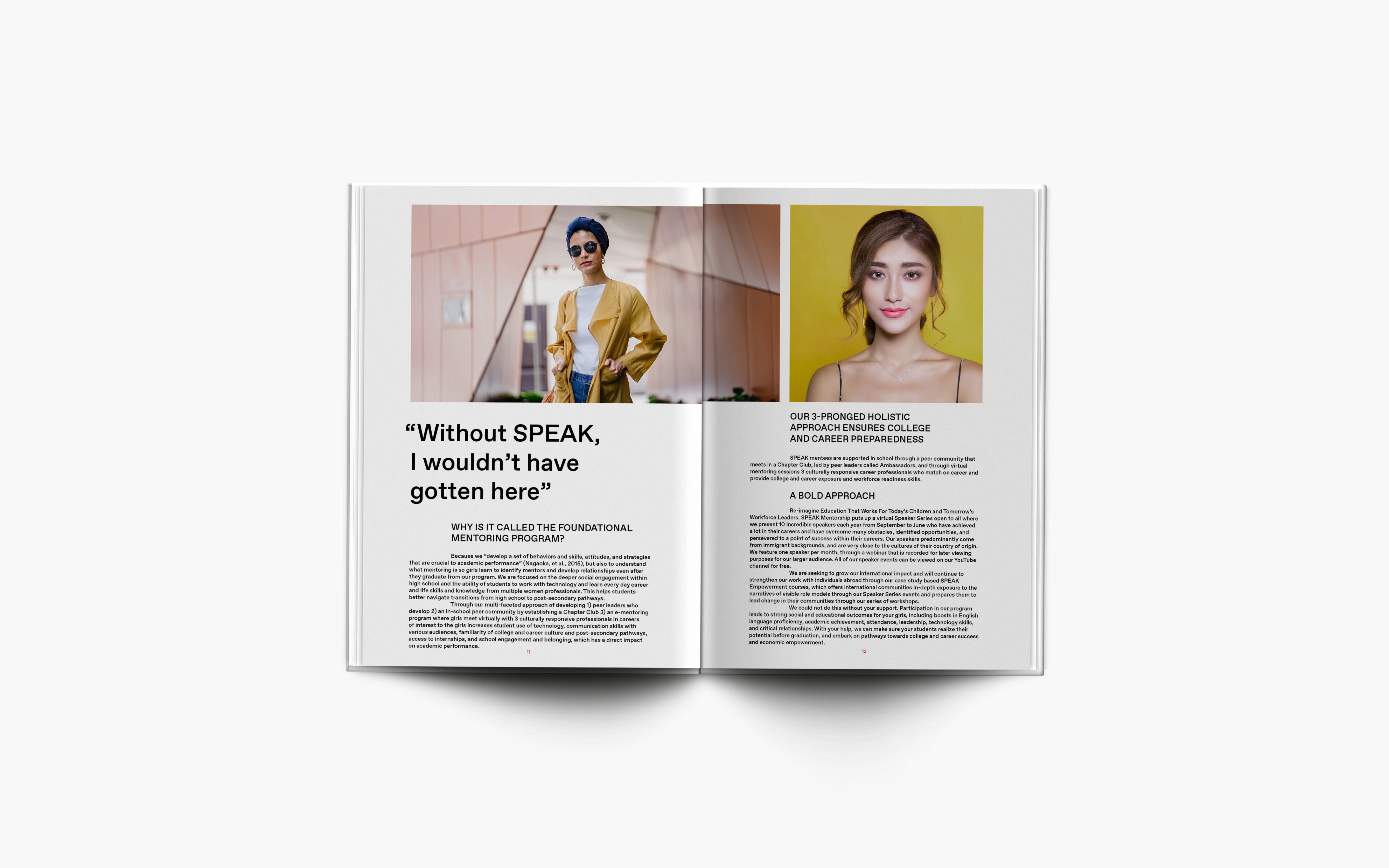
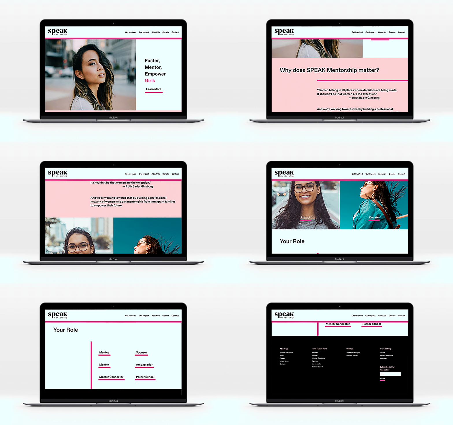
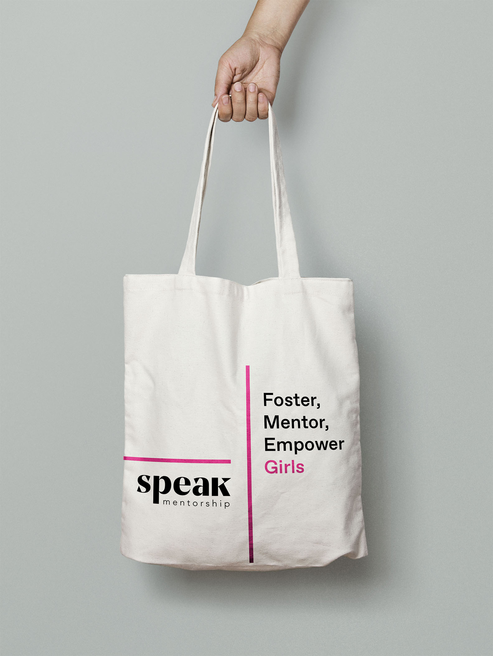
The final logos and applications are provided. While I kept the hot pink shade, I used it in very small amounts and chose a softer shade of pink when used in large amounts. For typography, I chose Favorit Pro. It was chosen for its easy readability and combination of traditional and experimental tendencies.
The final logos and applications are provided. While I kept the hot pink shade, I used it in very small amounts and chose a softer shade of pink when used in large amounts. For typography, I chose Favorit Pro. It was chosen for its easy readability and combination of traditional and experimental tendencies.


