Context
This was a personal project to rebrand the Cooper Square Committee. It is a non profit organization that works to preserve and develop housing and cultural spaces in the Lower East Side. I wanted to create an identity that is representative of their mission statement. They provide a source of knowledge to the members of the Lower East Side and build a foundation for their community.
This was a personal project to rebrand the Cooper Square Committee. It is a non profit organization that works to preserve and develop housing and cultural spaces in the Lower East Side. I wanted to create an identity that is representative of their mission statement. They provide a source of knowledge to the members of the Lower East Side and build a foundation for their community.
Current and Actual Design
I felt that their current logo and branding was too dated and was only reflective of their status in championing tenant rights. While obviously important, I wanted to create a new identity that is inclusive of their other efforts in building new cultural spaces. For example, they were heavily involved in building a transitional space for homeless LGBTQ teens. It is also way too tied to the visual identity of the current landscape of Cooper Square. The neighborhood will continue to evolve and I wanted a new identity that could evolve with the organization for years to come.
I felt that their current logo and branding was too dated and was only reflective of their status in championing tenant rights. While obviously important, I wanted to create a new identity that is inclusive of their other efforts in building new cultural spaces. For example, they were heavily involved in building a transitional space for homeless LGBTQ teens. It is also way too tied to the visual identity of the current landscape of Cooper Square. The neighborhood will continue to evolve and I wanted a new identity that could evolve with the organization for years to come.

Design
Due to their mission statement of building and fighting for housing, I was inspired by walls, foundations, and columns of houses and buildings. I wanted to use it as a metaphor for the organization to the community of Cooper Square. I began by gathering inspiration.
Due to their mission statement of building and fighting for housing, I was inspired by walls, foundations, and columns of houses and buildings. I wanted to use it as a metaphor for the organization to the community of Cooper Square. I began by gathering inspiration.

It was clear that the logos were more successful when there was a balance of abstraction and simplicity. When the logos were too literal (such as the first set of column ones), they came across less refined. My biggest concern with these was whether the symbol would read well when used at very small sizes.
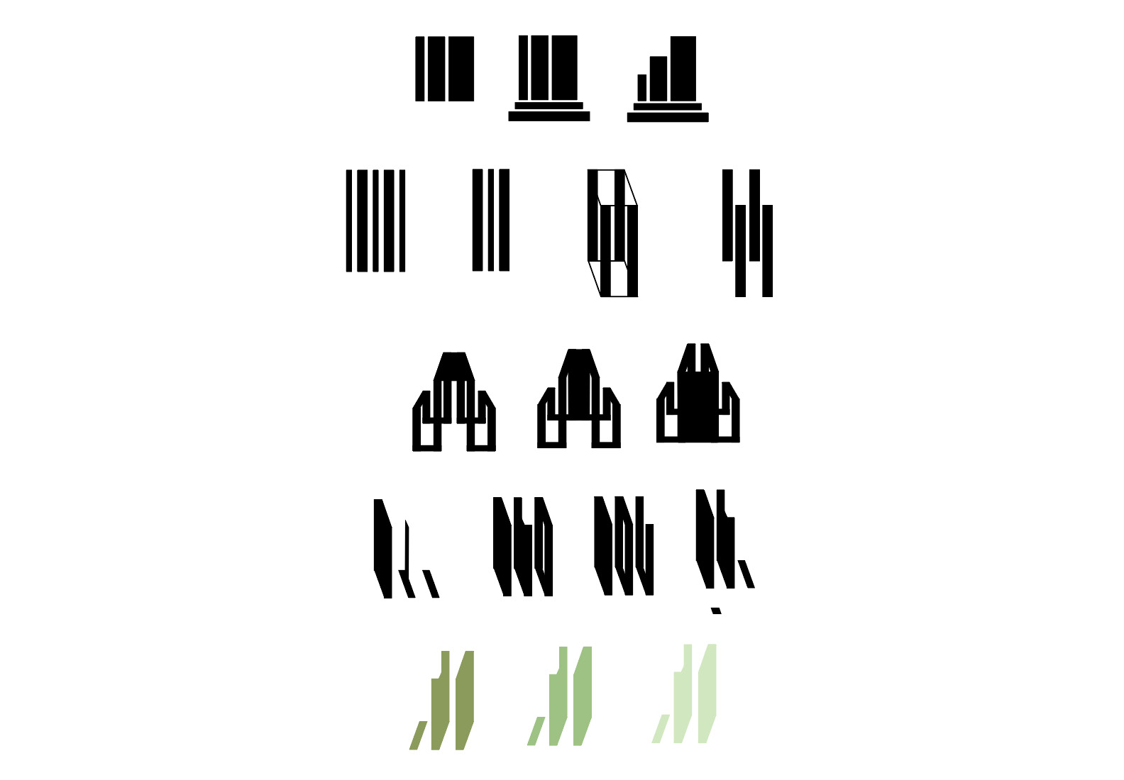
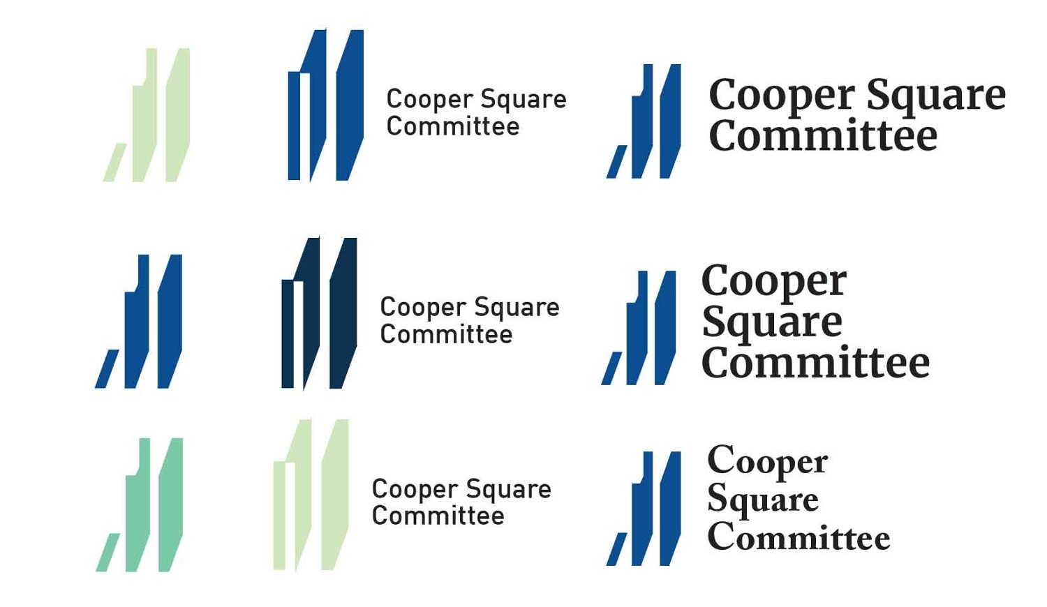
I still felt that the logo was too complicated and worked to simplify it further. My final logo struck the balance between abstraction and simplicity that I desired while still readable at different sizes. I eventually chose DIN for the logotype due to its history in traffic and signage. It felt appropriate for the organization's mission. The color blue was chosen to connote a sense of responsibility.
Visual
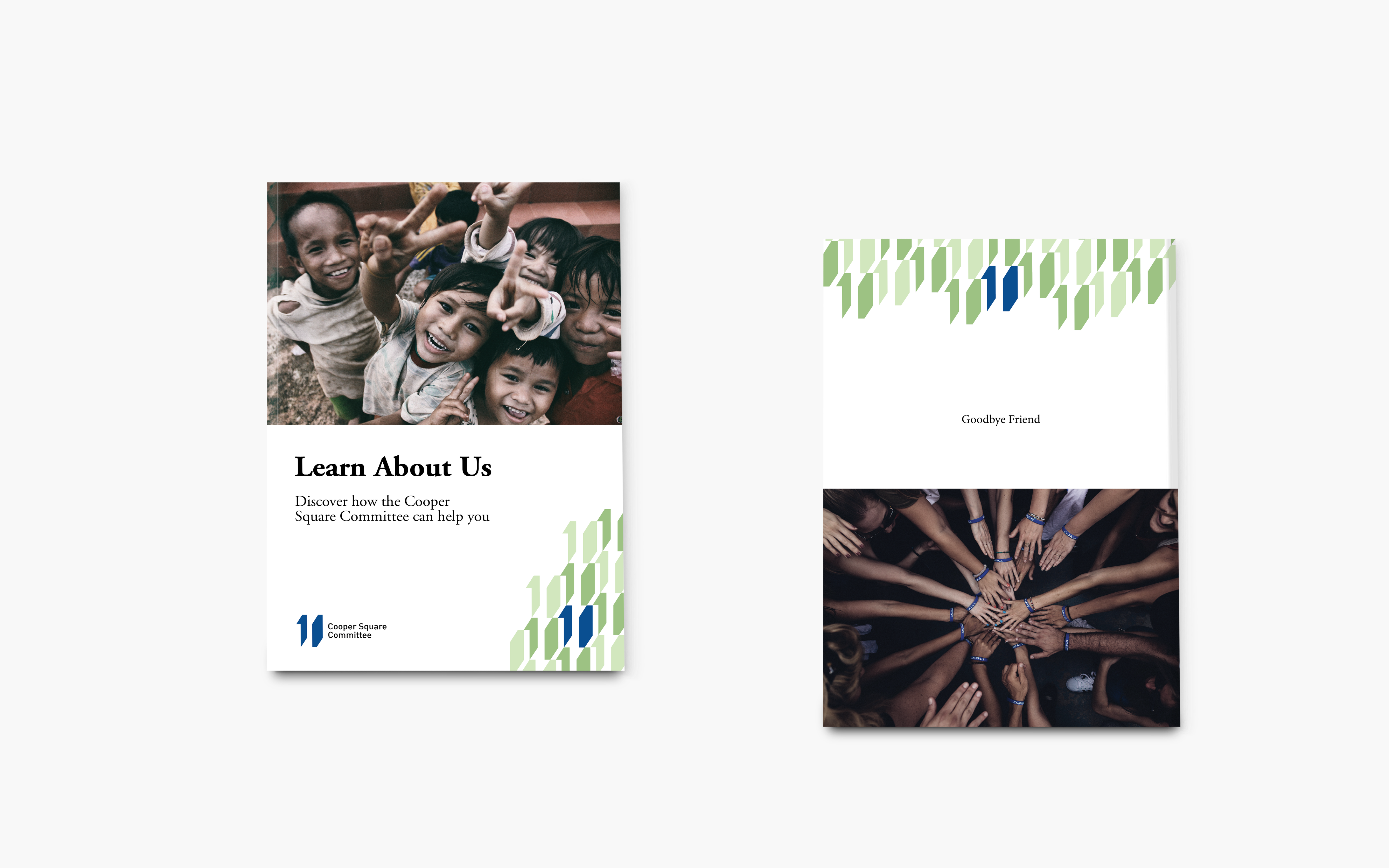
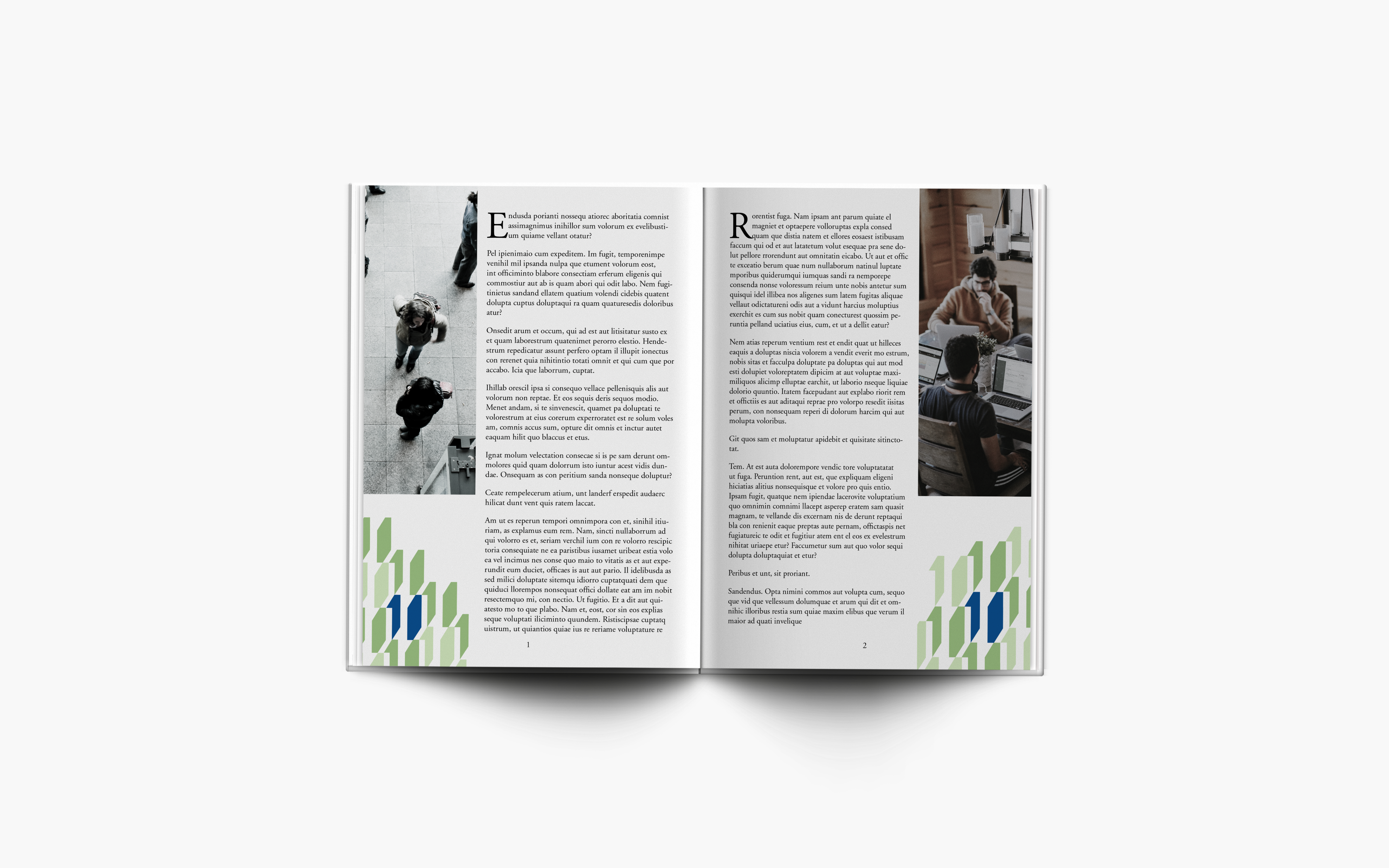
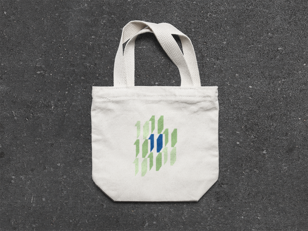
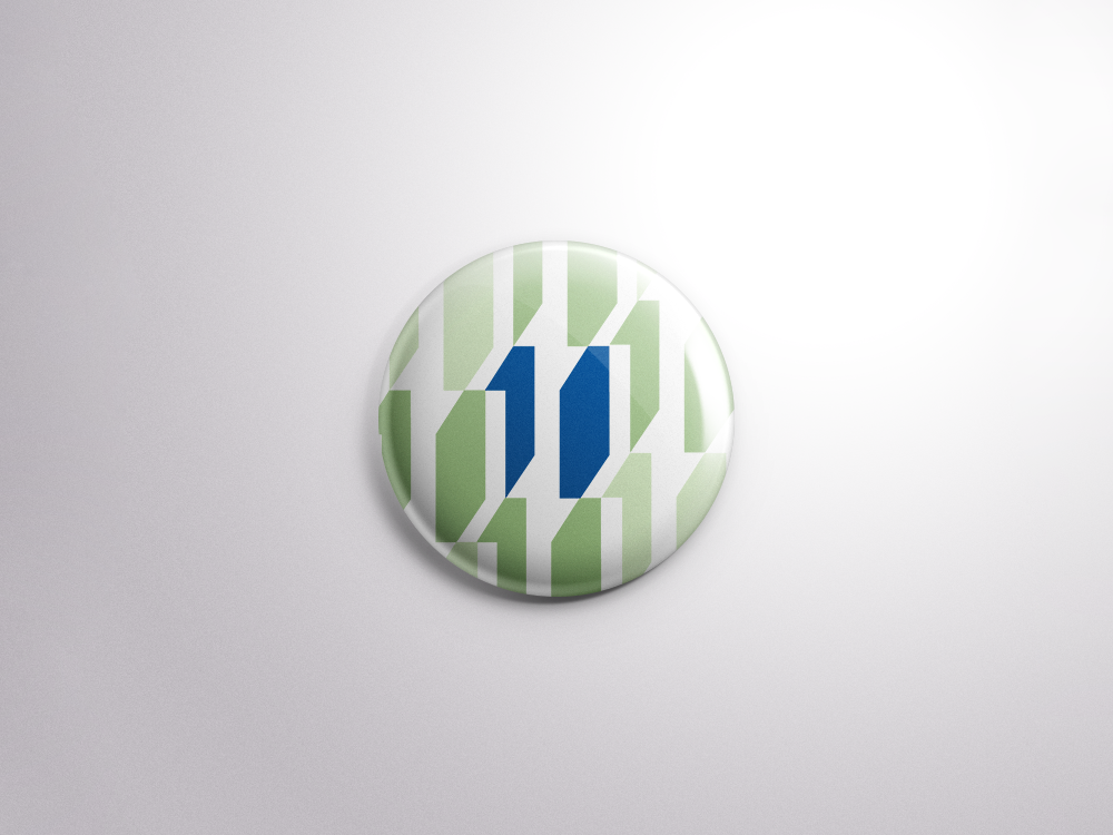
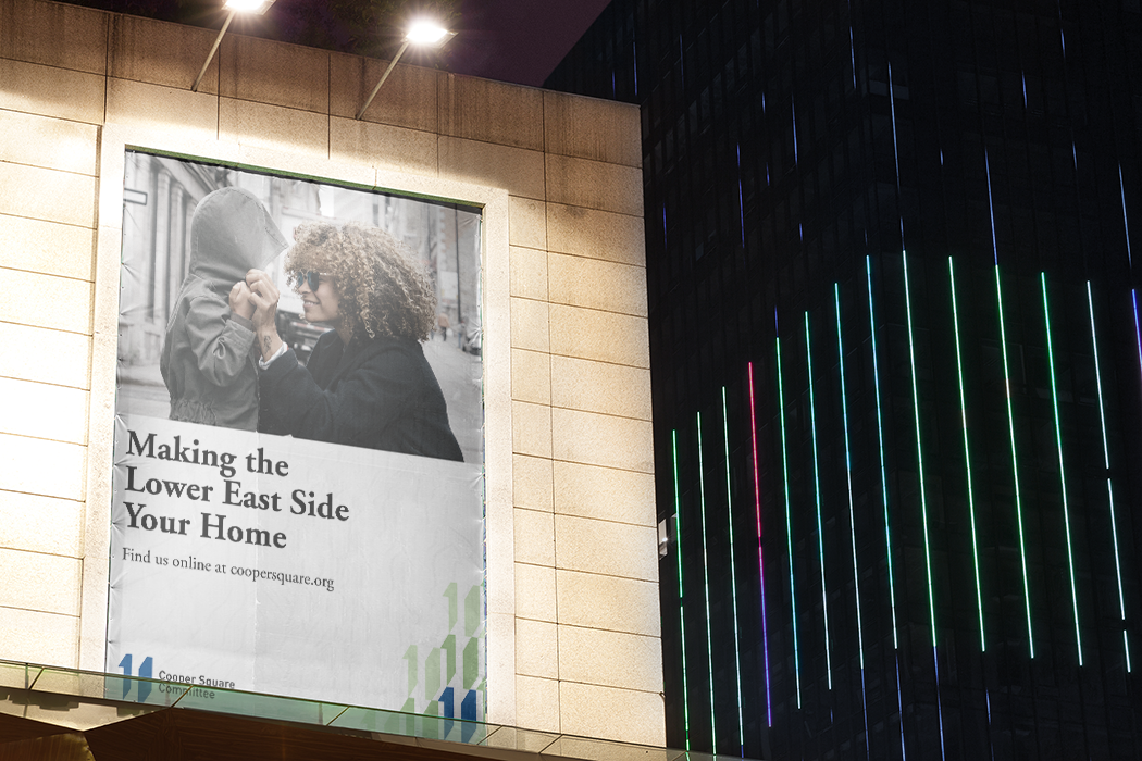
The final applications are below. For typography, I chose Adobe Garamond due to its easy readability and traditional personality.
The final applications are below. For typography, I chose Adobe Garamond due to its easy readability and traditional personality.
